
Funda's Team Search introduced the long-awaited multiple saved searches feature in fall 2023. Product Designer Marcela Ramos played a key role in its seamless implementation after a successful technology migration. Dive into her journey here.

In this blog Marcela details the design-to-launch journey in 5 steps, covering discovery, design challenges, user testing, feature promotion and ongoing improvements.
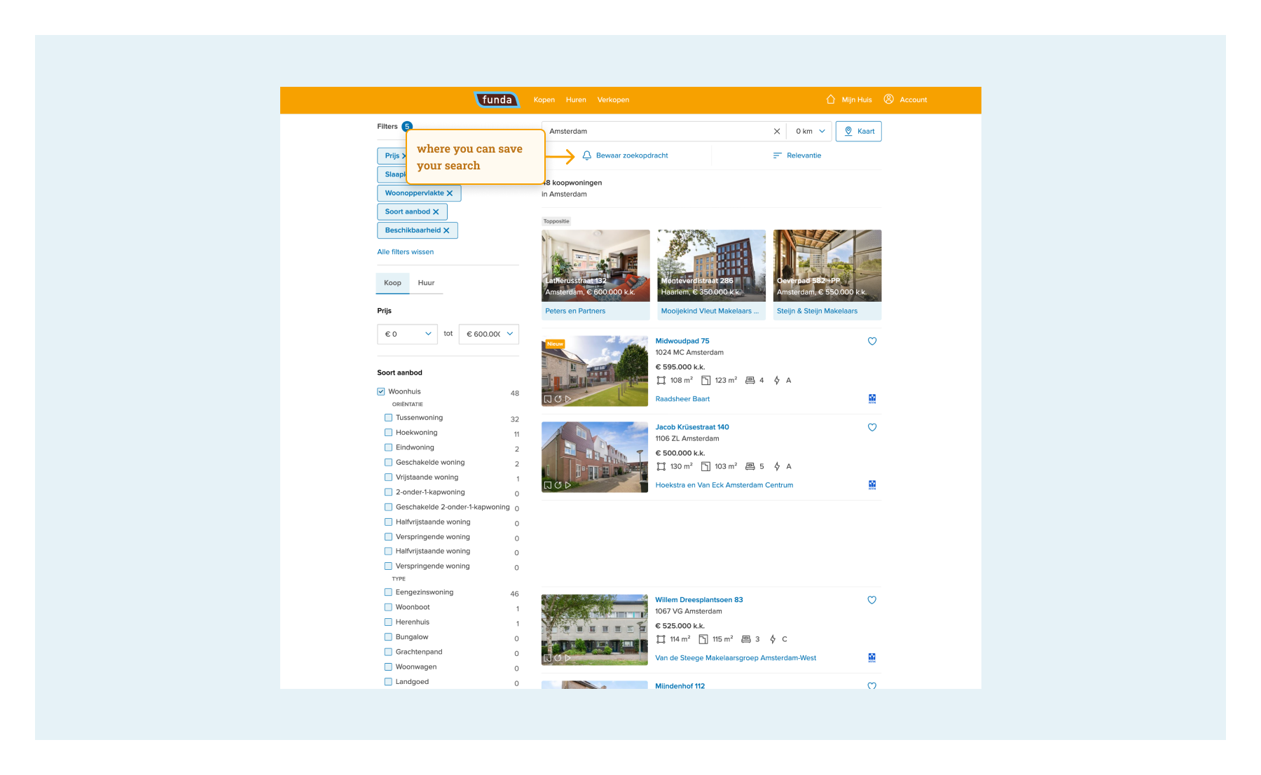
What is the saved search?
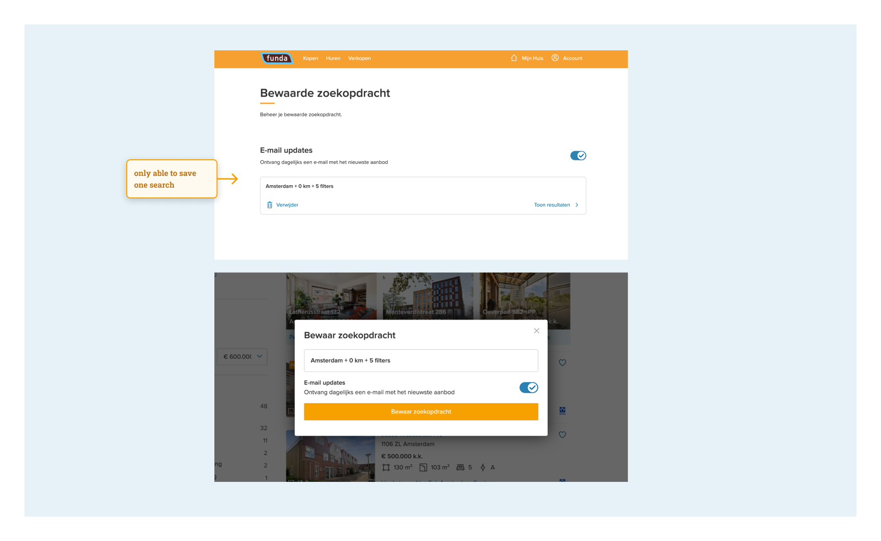
At funda you can save your search. This means that your preferred search criteria, like location, price range and square metres, are saved in your account, so you don’t need to apply all your favourite filters again every time you visit the website – saving time and making it easier and faster to search for a home. You also get an update in your mailbox or notification on your phone as soon as a new house is available on funda that fits your criteria. Until last autumn, users were only able to save one search.
Step 1. Discovery
Defining user and business value
Before launching a new feature or product, we need to know if there is a market for it. Fortunately, at funda we are lucky to have many involved users who love sharing their funda experience with us. That is how we knew from data that a lot of people wanted the possibility to save more than one search. We received regular requests each month to add this feature.
Users asked to get updates for different searches, so they could easily be notified of new homes available in a different price range, or to help a relative search for a new home. Before we even started thinking of solutions, it was very clear that there was relevant user value in building this feature.
For funda, the focus was on enhancing user retention by delivering the best experience. In order for users to save a search, they simply need to create an account – there's no alternative, as we want to ensure the safe storage of their data. This not only results in more accounts but also provides valuable insights into our customers. Understanding the needs of our target audience allows us to continually improve our product for an even better user experience.
Benchmark research
This is for me as a designer one of my favourite steps of the design process, because I get to gather a lot of insights and get inspired by so many different possibilities. It always feels like my head is exploding with ideas that I just can’t get down on paper yet.
My research focuses on how other companies implement similar features, exploring aspects like user flow, the number of steps to save a search, placement of the save search feature, the format of 'new property available' emails, the number of properties displayed in emails, the limit on saved searches, and additional features like renaming, editing or deleting searches.
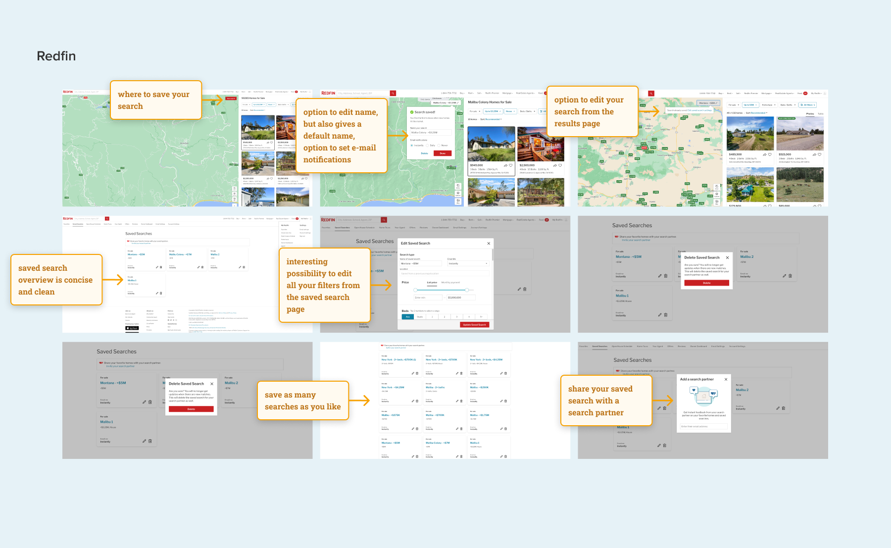
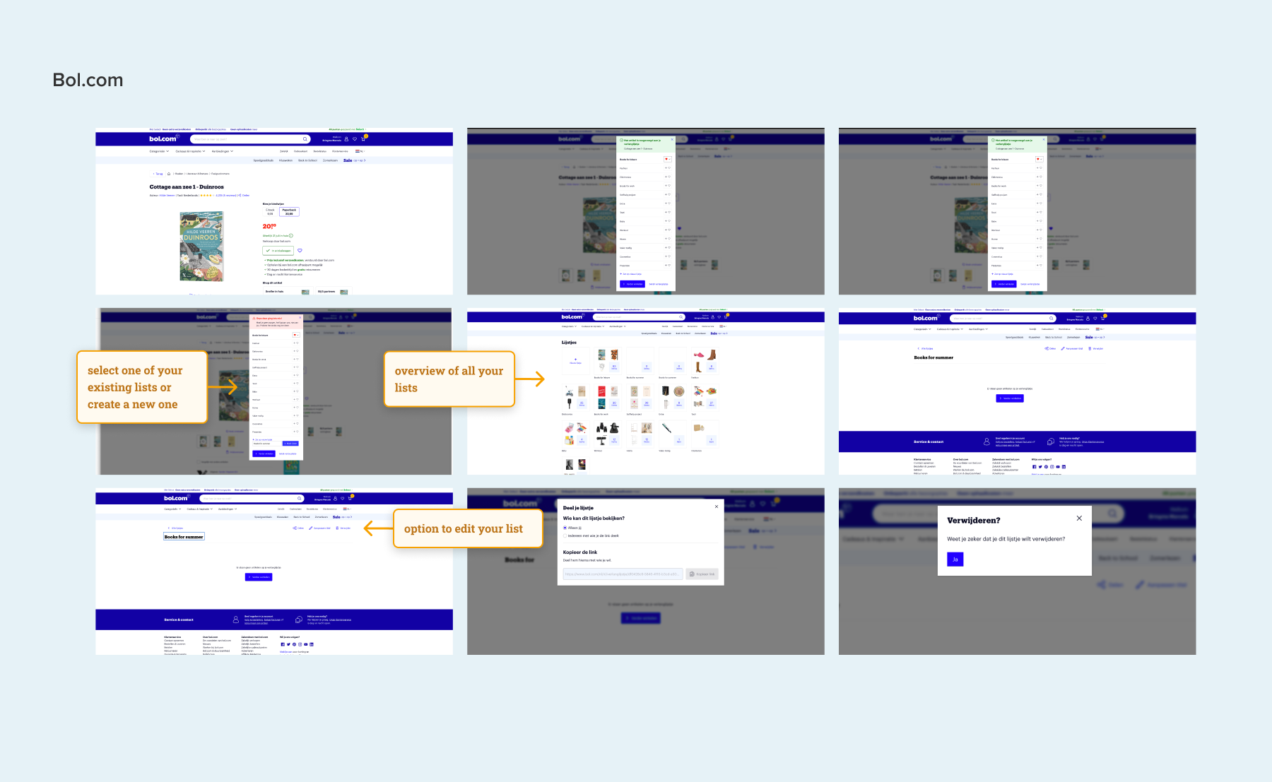
To look outside of the box I seek inspiration beyond the real estate industry, exploring user-friendly designs on platforms like Airbnb or Bol.com. Additionally, I draw insights from social media, aiming for recognizable and intuitive patterns for a broad audience.
Funda insights
I also consulted our product manager, Hans, to understand our current save search process. I explored its appearance, identified existing issues, inquired about user navigation from saved searches emails, gathered feedback details, and assessed the current user adoption of this feature.
Delivery
At the end of the first step I have a document on Figma, the design tool we use at funda, where the insights, what, why and how (the 'we mights') are defined. This is what I use as input to start designing solutions.
Step 2. Designing & refining
This step is the time to start putting all those insights on paper. That is when the details, challenges, different scenarios and states become clear.
While designing the 'Save Search' flow, I encountered a few challenges regarding what happens after users click on ‘save search’. These were the top 2 challenges:
Challenge 1: Max number of saved searches per user
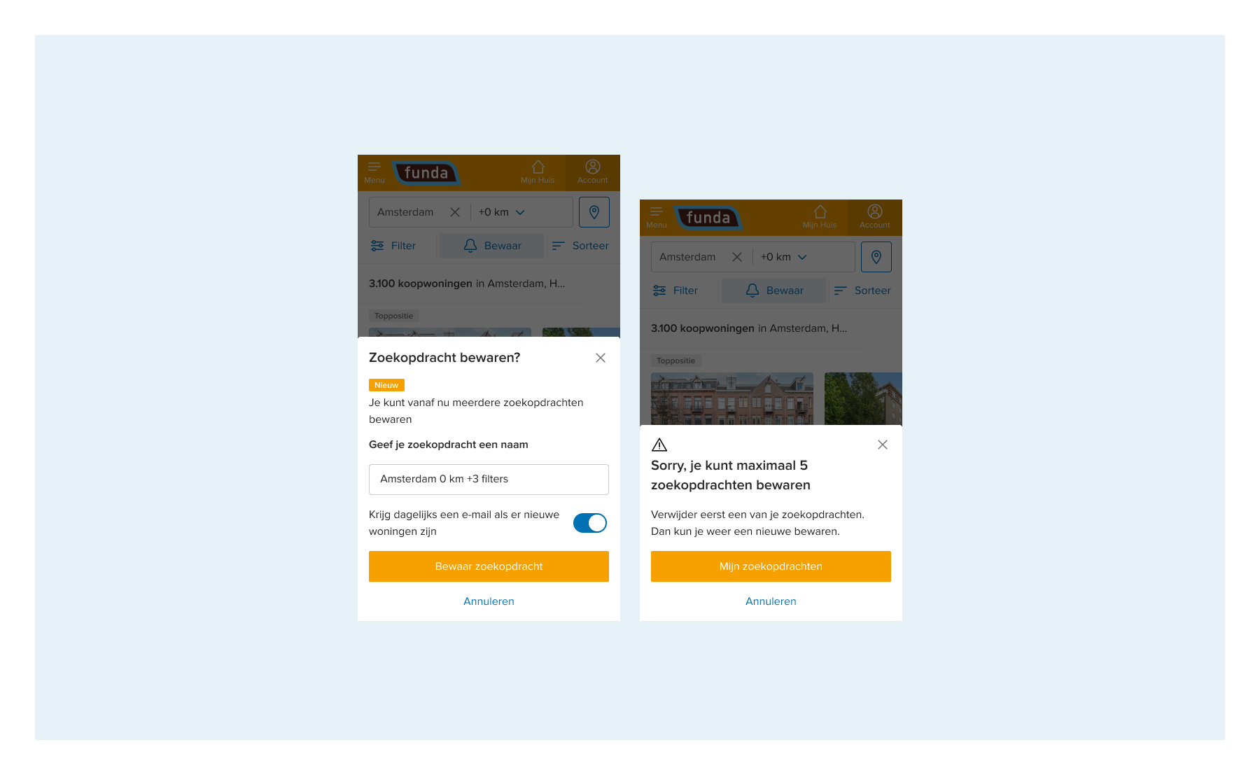
One technical requirement for this feature was limiting users to a maximum of 5 saved searches. The design challenges included:
- Communicating the limit to users effectively;
- Ensuring a seamless and friendly user experience when the maximum number of saved searches is reached;
- Clearly indicating to users that each new save counts towards the limit.
Inspired by e-commerce websites like Bol.com, where you can easily save an item in one of your previously created wish lists, I started with the idea of replacing a current search or creating a new one. I made different iterations to make that possible:
1. Provided the option to either replace or create a new one:
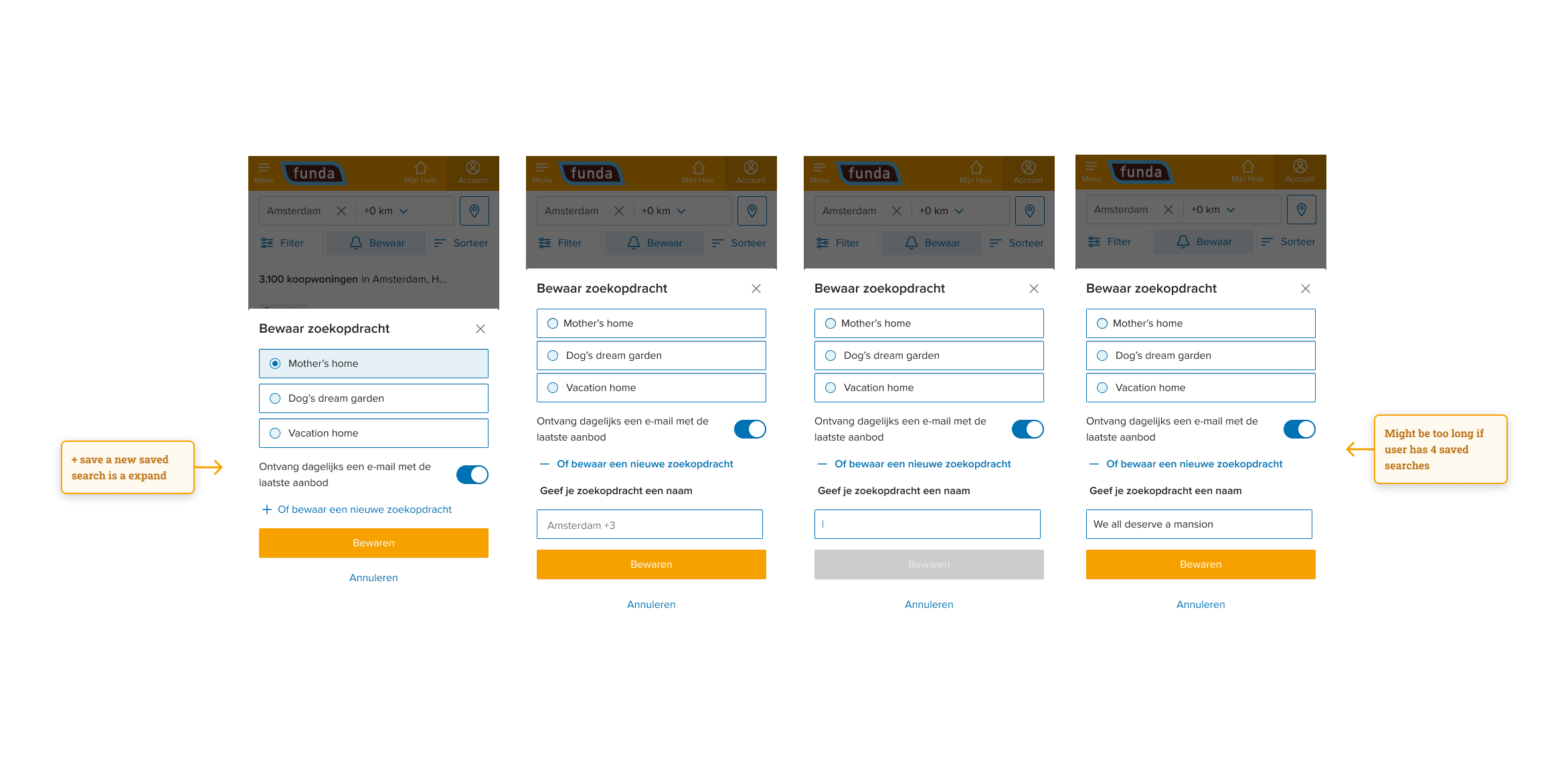
2. Provided the option to replace an existing saved search or a two step process when the limit is reached
During the refinement process, we concluded that replacing or deleting an old search introduced more complexity to the feature, both technically and in terms of user experience.
However, including the possibility to either replace or delete an old search within the save search flow would mean two things:
- That users would be aware they are either saving a new search or updating one of their current saved searches:
We knew from other real estate marketplaces that this was one of their biggest problems with this feature. Users don’t know that they are saving new searches; they might expect to be editing their current saved search.
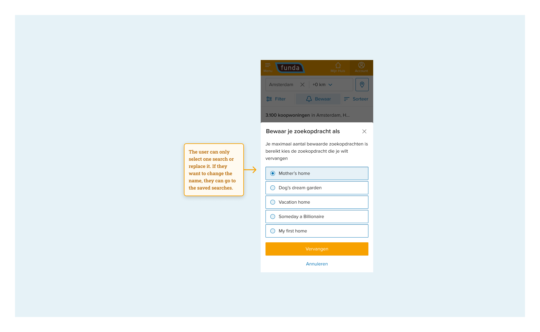
- When they reached the limit of saved searches, they would be able to replace/delete an old search while still in the saving flow:
The only other option was to show a message that the user had reached the limit of saved searches and give the option to go to the saved searches page and delete a previous search.
As a designer, I was really against interrupting the user flow so dramatically, because it would mean that the users would be clicks away from their main goal. Another concern was that they would lose all the search criteria that they had previously selected and decided to save, as they would be obliged to leave the page.
We had to refine this challenge many times with the whole team. After many discussions this is what we concluded:
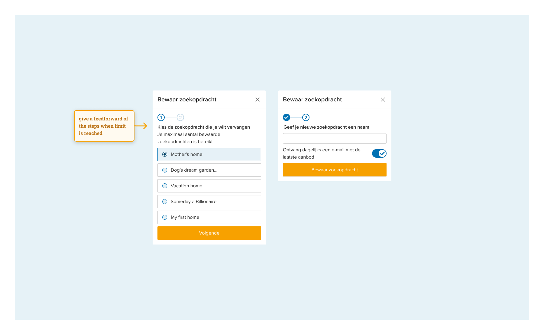
- For the MVP (Minimum Viable Product), we opted to include an error message to expedite development and gather usage insights for this new feature. Uncertainties, such as the percentage of users saving more than five searches, led us to focus on essential functionalities.
Replacing and deleting saved searches in the flow proved too complex for now. The only requirement from user experience for this decision was that the previously selected search criteria were going to be remembered when the user went back to the search result page after deleting an old search. With this agreement, we moved forward.
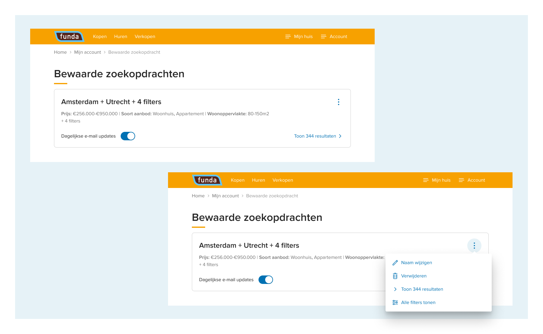
Challenge 2: Giving the saved search a custom name
Initially, we assigned default names for the saved search based on location and filters, causing issues for users with multiple searches in the same location. To address this, we implemented the option for users to give custom names, enhancing the experience.
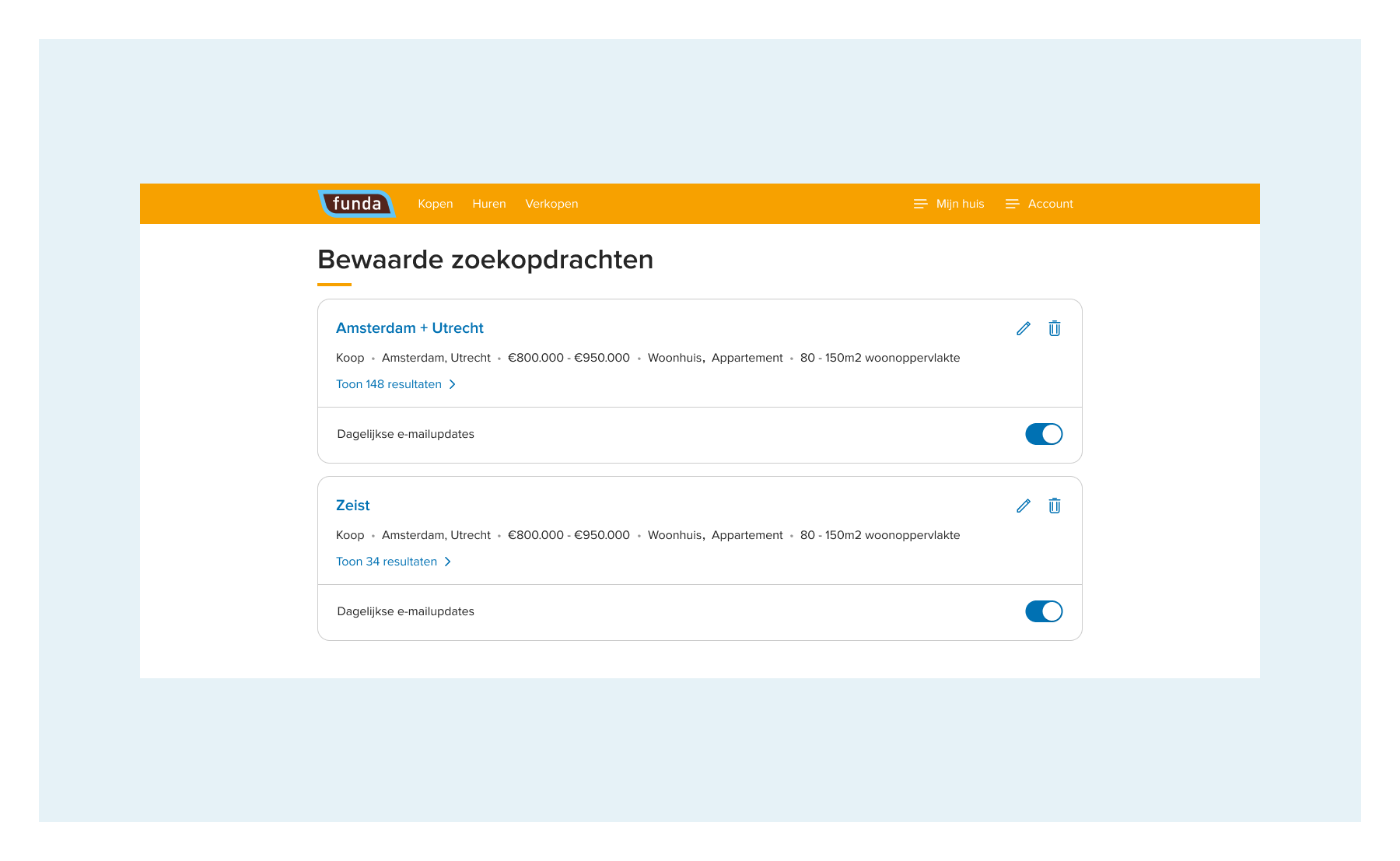
In the save search flow, users can easily choose between the default and a custom name. However, introducing this on the saved search page presented challenges. This page aims to provide an organized overview for users to manage searches. I added an editing feature using a pencil icon for users to change names, but I needed to implement the delete searches and toggle email settings as well.
The challenge was designing a compact saved search card accommodating all these interactions; I made many iterations, as you can see below. After consulting with the design and scrum teams and considering benchmark examples, simplicity was prioritized for the MVP. This makes all interactions visible to reduce user effort initially, with future improvements based on user behaviour.
Step 3. Prototyping and testing
As we already knew that users truly wanted this feature, we didn’t need to do a concept validation. Our uncertainties were related to how consumers would use the feature and if the user experience was clear. We discussed with our research team and they proposed a ‘traffic light’ style test with a beta version. The beta version would make sure users have the most accurate experience, and as we were going to build the feature anyway this was the logical choice.
The test would limit the risk of negative user feedback because of usability misunderstandings. By answering the question of to what extent all essential tasks in multiple saved searches can be executed without friction, we minimized this risk.
See also: Running Playwright tests in Azure DevOps: A step-by-step guide
Five participants joined the qualitative test at our office. We gave them different tasks to execute so we could validate these interactions:
- Save a search
- Add an extra search
- Edit a search
- Delete a search
- Change mail settings for a search
- Add a search when saved searches limit is reached

Hiccups from user testing
We got some valuable insights during the test, but we did agree beforehand that we would consider impact vs effort to decide which of the insights we optimized before release. These are the hiccups we saw in the user test and what we did to address them:
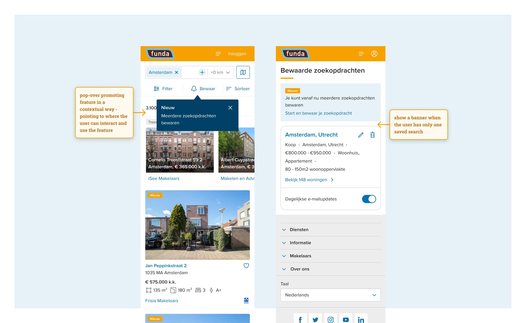
- Difficulty in finding the ‘save search’ button on the search result page. We solved this problem by creating better findability for this button during promotion – see the last step below for more details.
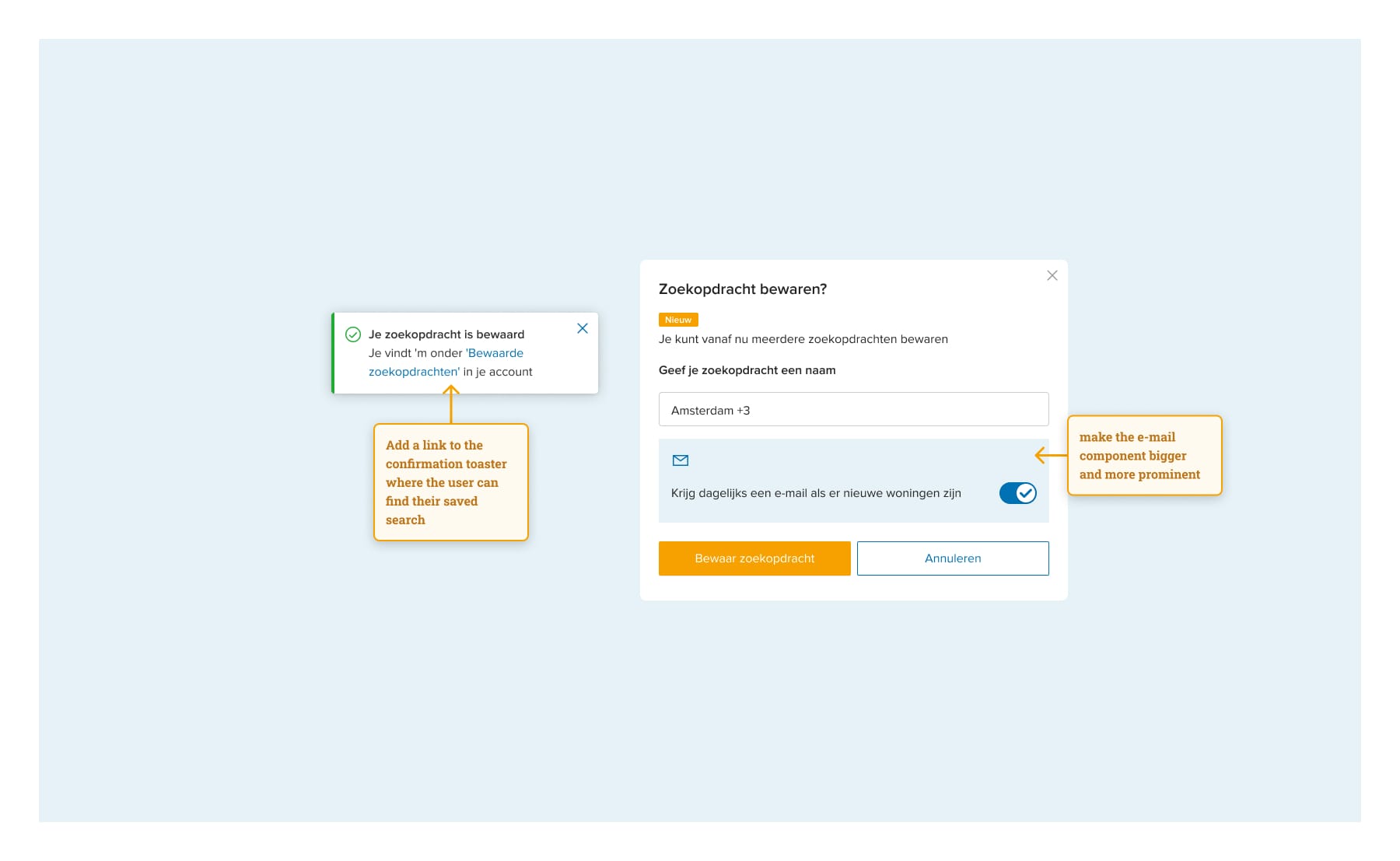
- Users struggled to find their saved searches on funda.nl. Various optimization methods exist, such as adding a main navigation entry, but this could heavily impact other areas. Instead, we chose a simple solution: adding a link in the confirmation toaster for easy access to saved searches.
- Users miss the email toggle when saving searches, unaware of its default setting. While the toggle is clear on the overview page, we hesitated to add a new component to the save flow, awaiting further insights into the issue's extent. Yet, as a designer, I identified options to highlight this feature in the flow.
- Users encountered difficulty returning to the homepage from the saved searches page. We explored solutions like a back button or breadcrumbs. However, we questioned if this difficulty arose due to the test context, where users followed a predetermined task order, unlike real-life usage. Users transitioned from adding saved searches to viewing results with a different mindset. We pondered whether users would intuitively add new searches from the results page rather than the saved searches page.
- On the saved searches overview page, users mistakenly used the pencil icon to edit the entire search, instead of realizing it was for editing the search name when they clicked on the name itself. I experimented with various solutions, like adding a "edit name" link next to the pencil icon. However, users quickly grasped the feature's functionality and stopped making this error.
- Deleting a saved search and turning the email toggle on or off in the overview page was clear. They didn’t mind turning it on and off one by one.
- Many users confirmed that they would save a max of 5 searches.
- Editing existing searches is not currently offered due to complexity in implementation. Users must save it as a new search and delete the old one, which is more cumbersome and time-consuming. However, we expect users to be able to easily maintain their saved searches by providing the overview page.
Step 4. Launch and promote
When launching a new feature, promotion is essential for user awareness, often done in collaboration with marketing. For this feature, we implemented a pop-over, a familiar pattern to explain features without being intrusive. The challenge was crafting concise copy to communicate multiple points, such as the addition of a new feature enabling users to save multiple searches and the unique selling point of receiving updates for new houses fitting their criteria.
We decided to put the focus on the new as this was more triggering, and easy to scan if people didn’t feel like reading too much. We kept it short and snappy and it worked:
Step 5. Monitor and grow
This step is continuous. We use different tools to understand user interaction with this feature. This way, we can validate the uncertainties we defined during the design-to-launch process. We make sure to keep on improving the feature, where necessary.
What have I learned and what would I do differently?
It's important to note that the process doesn’t necessarily unfold in a linear progression from steps 1 to 5. Some steps overlap and repeat during the process. This project was particularly exciting for me as it was my first major project within the product team.
I learned that although it is acceptable to generate multiple solutions as we progress and refine together, thorough preparation is crucial in determining scope and feasibility. As we are all highly critical and analytical in the team, discussions and analyses can take some time, so this part of the process could be more efficient next time.
That's why, for our upcoming project focusing on neighbourhood search, we're experimenting with a new approach. Before diving into design work and refining solutions, we'll conduct a brainstorming session involving the entire team. By gathering insights from everyone beforehand, we will ensure alignment and cohesion in our direction. Through this method, we aim to build upon our learnings from the multiple saved searches project, striving for even greater success.
Question?
Do you have a burning question for Marcela after reading this blog? Feel free to reach out to her via email.
See also: Game changer: why we implemented an Advertising UI library (and how)